- Enhance the overall page UX
- Add and emphasize on page callouts to enhance SEO
- Refresh and refine the visual direction of the page
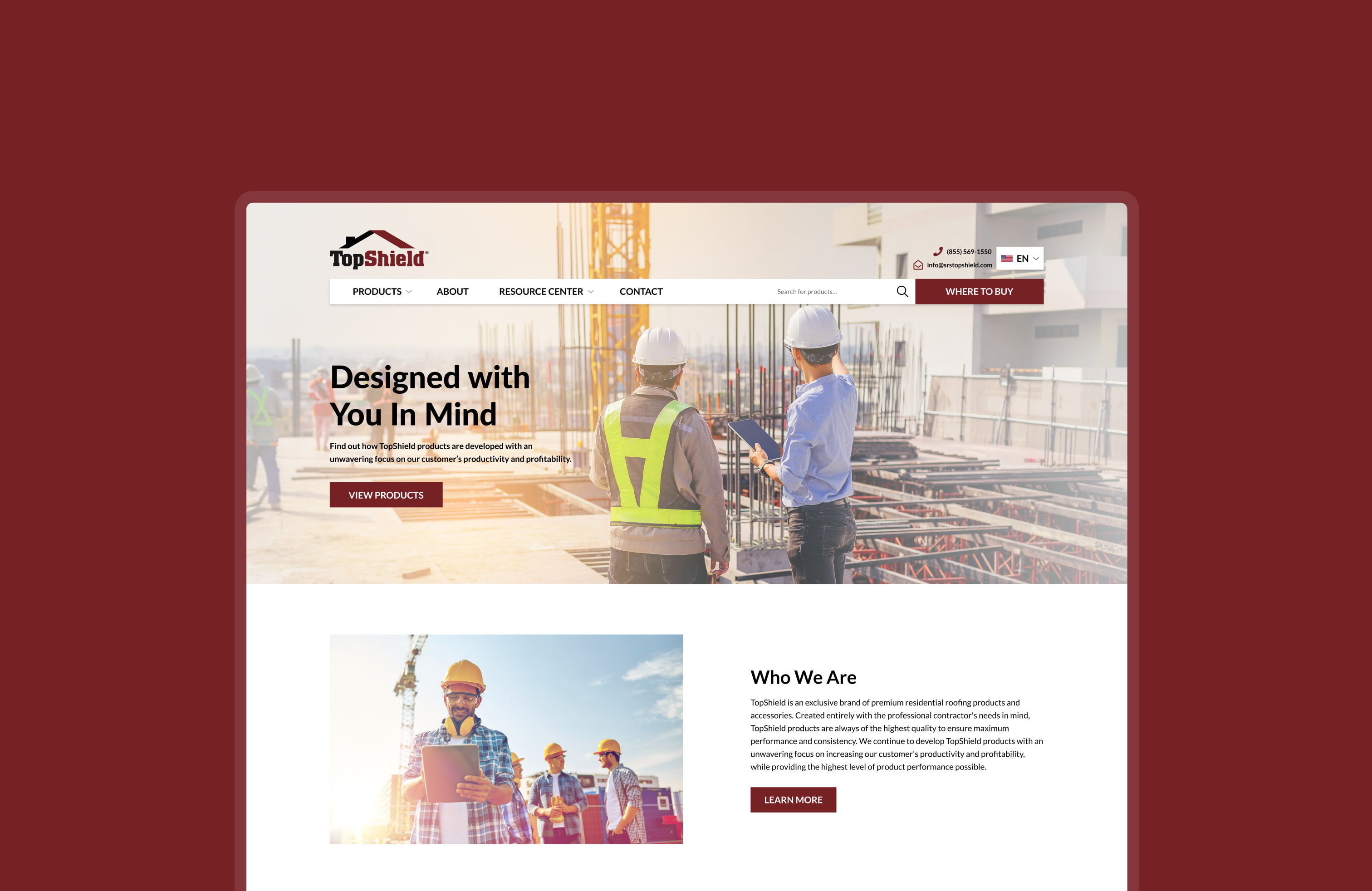
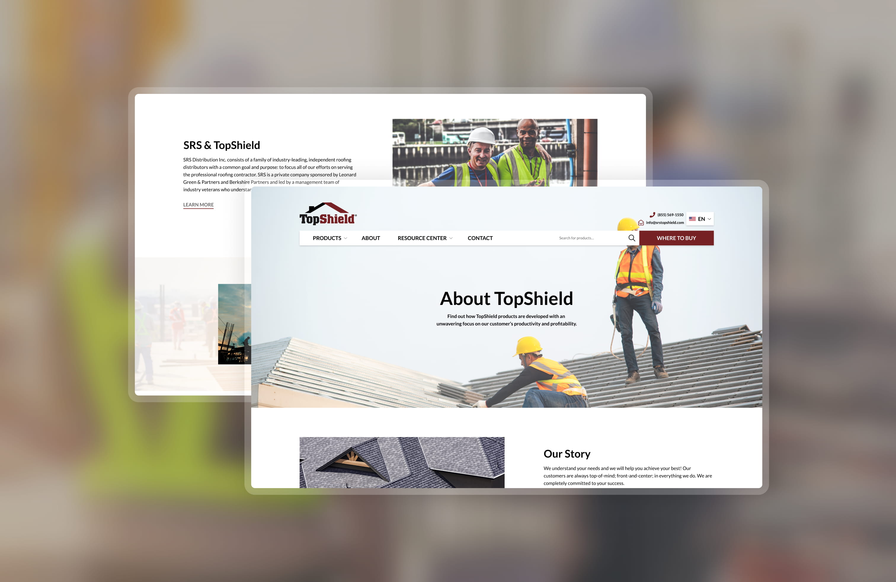
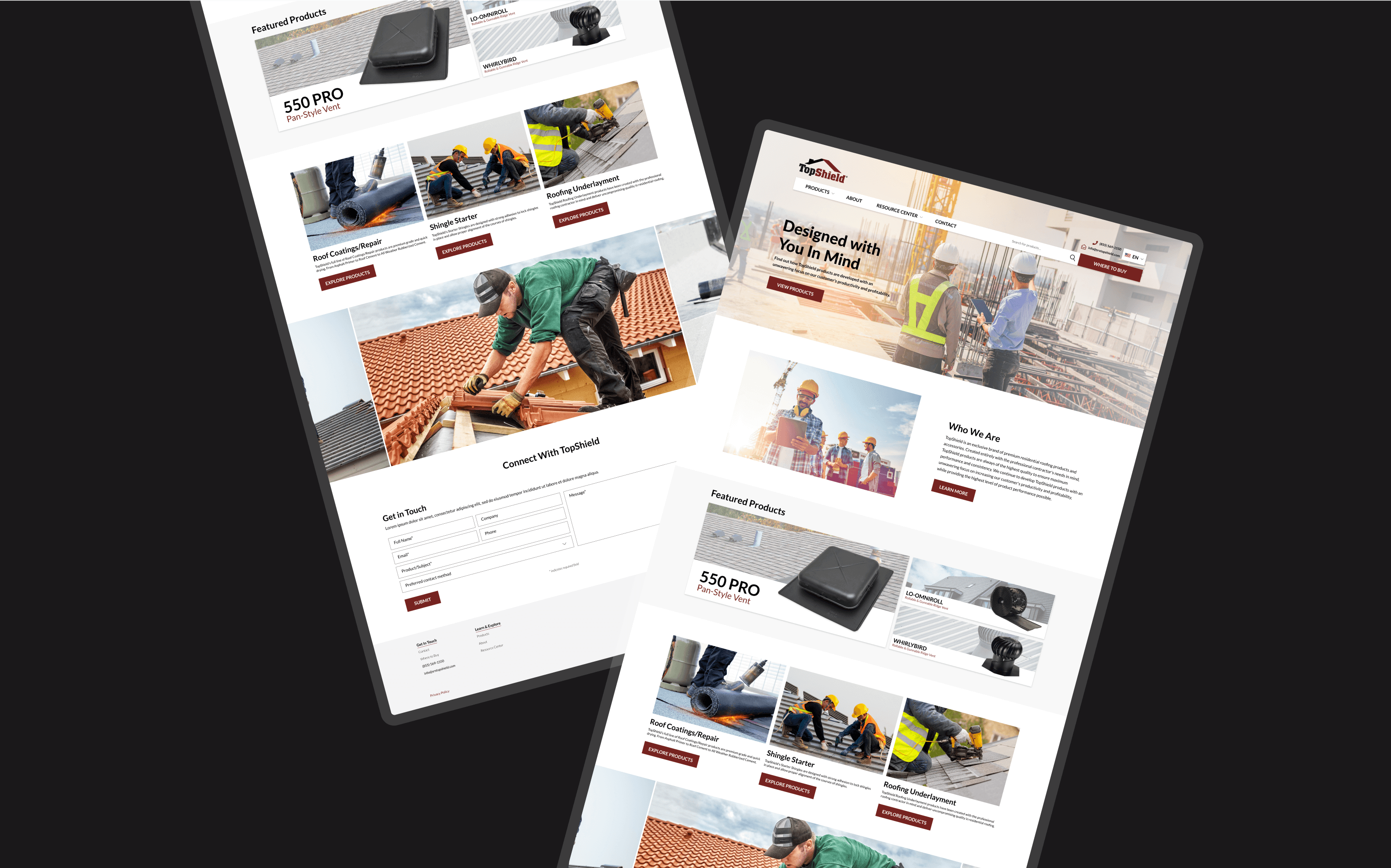
Looking to compete with leading brands, our design team was tasked with overhauling TopShield’s website’s landing page. Pulling inspiration from leading competitors, our design team redesigned the landing page to be sleek and easy to navigate. Read below to learn more about the new and improved TopShield landing page.

Looking to compete with leading brands, our design team was tasked with overhauling TopShield’s website’s landing page. Pulling inspiration from leading competitors, our design team redesigned the landing page to be sleek and easy to navigate. Read below to learn more about the new and improved TopShield landing page.
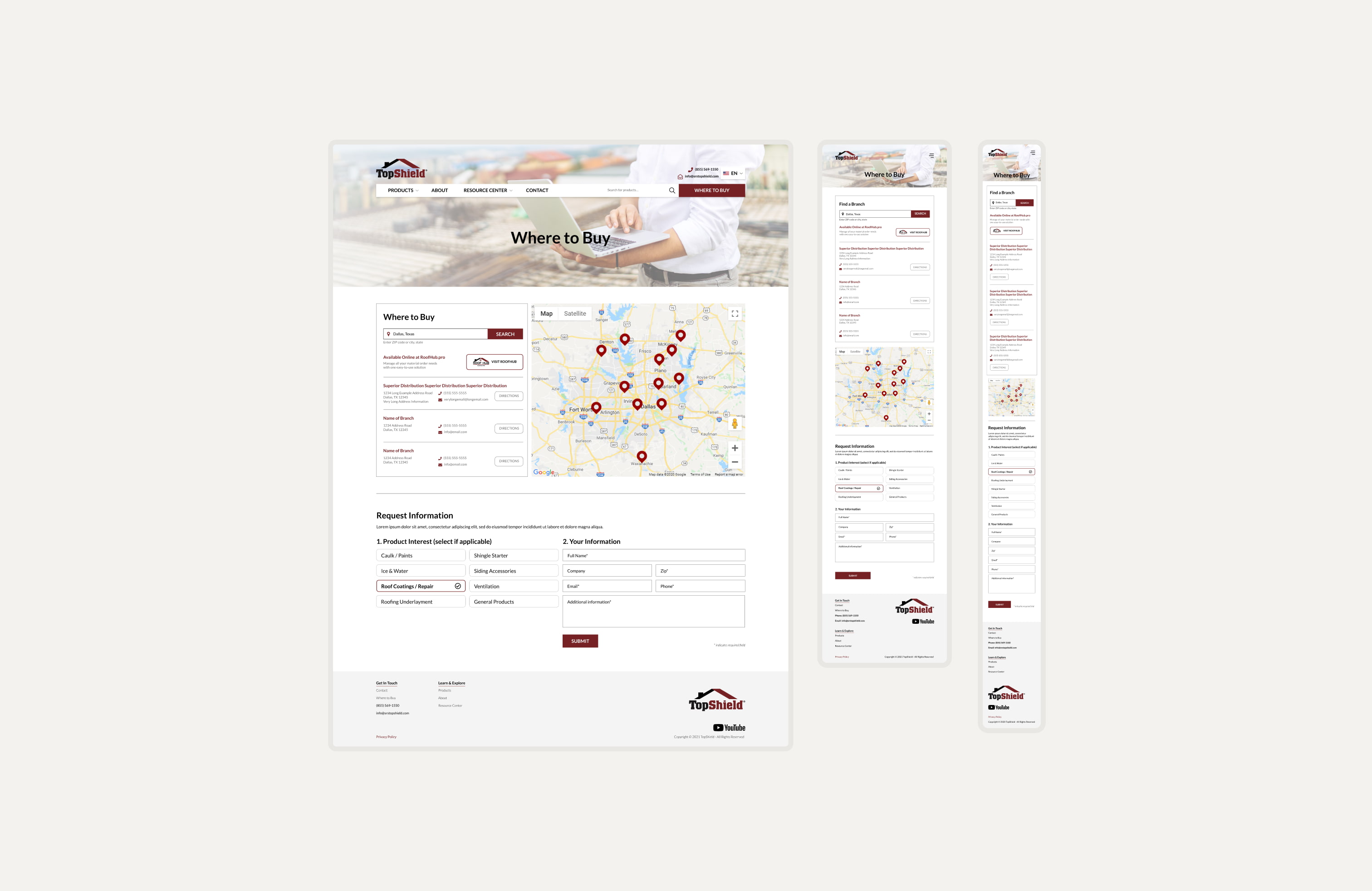
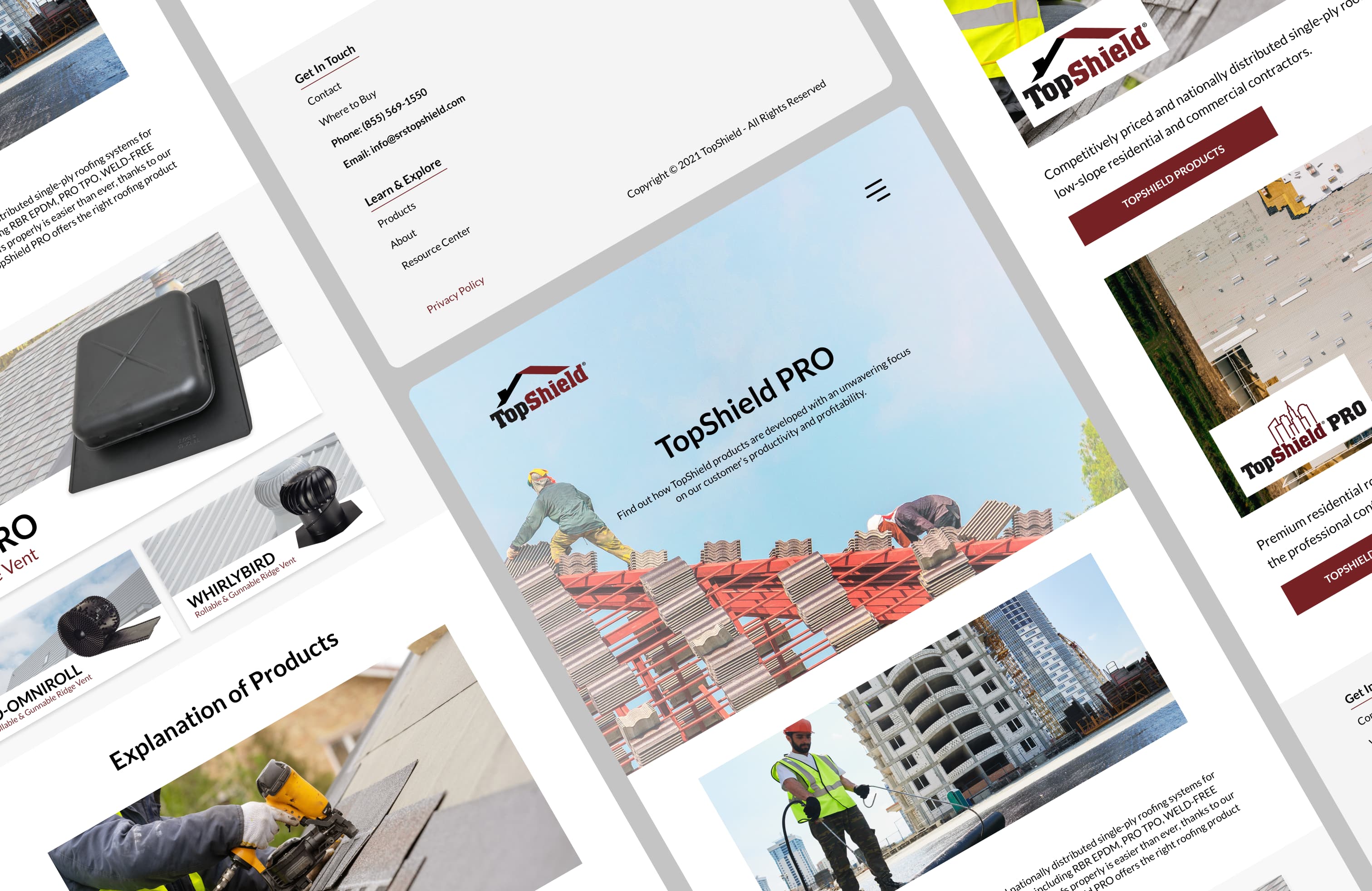
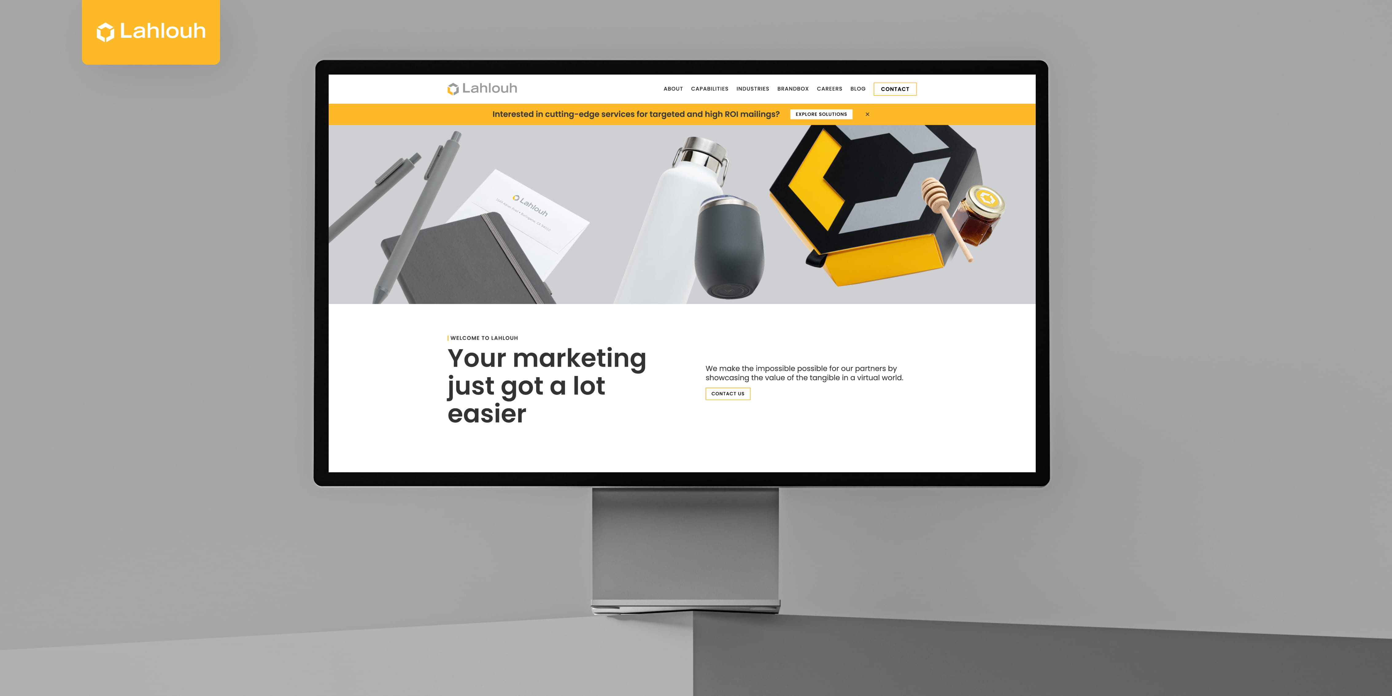
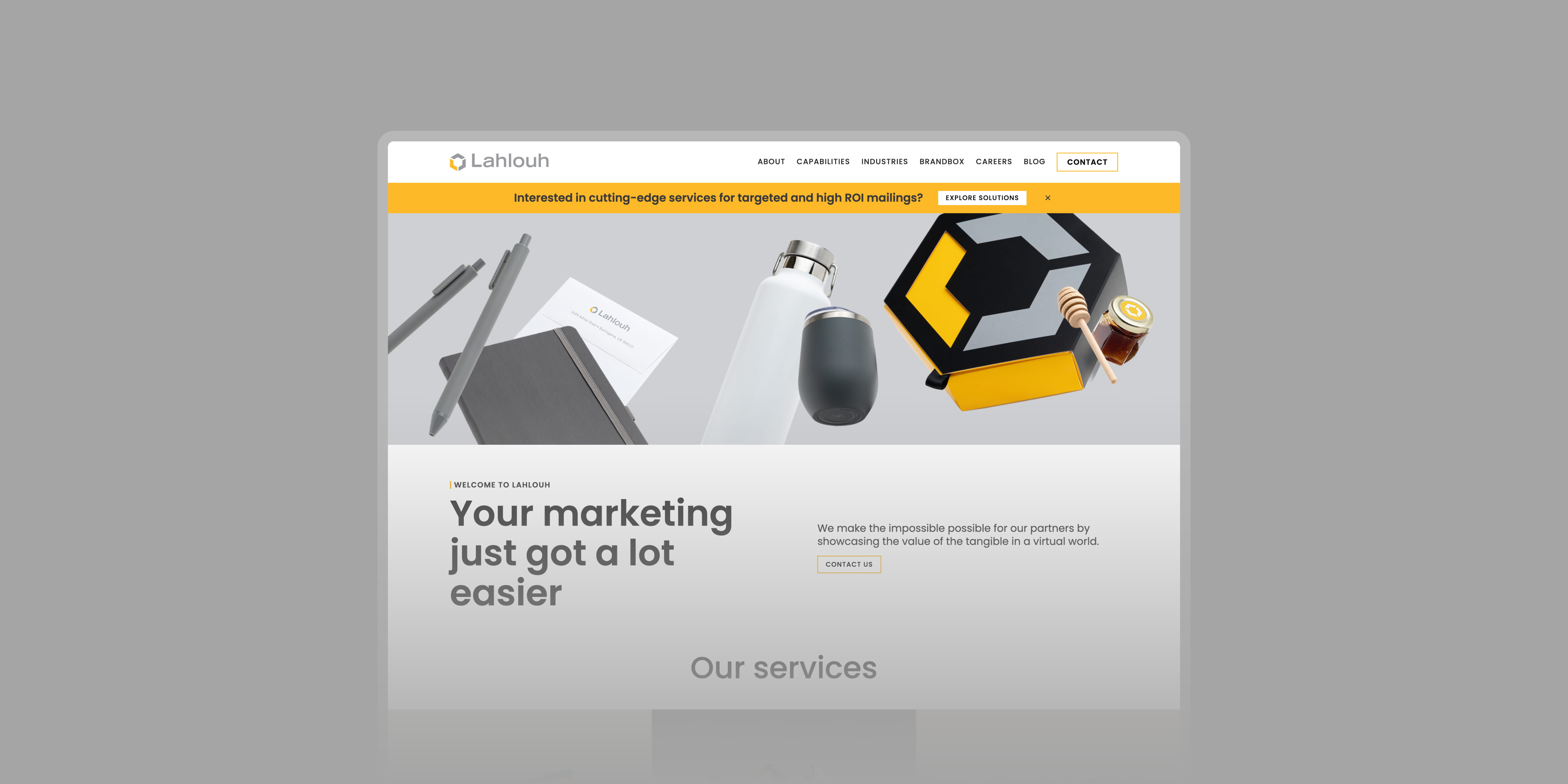
To further highlight the brand’s strengths, we created a simple four card callout with short descriptions that showcase the brand’s distinctiveness. For example, two of TopShield’s main selling points are it’s sustainability and affordability. With this in mind, we highlighted these two features in the card callout.
Looking to compete with leading brands, our design team was tasked with overhauling TopShield’s website’s landing page. Pulling inspiration from leading competitors, our design team redesigned the landing page to be sleek and easy to navigate. Read below to learn more about the new and improved TopShield landing page.
To further highlight the brand’s strengths, we created a simple four card callout with short descriptions that showcase the brand’s distinctiveness. For example, two of TopShield’s main selling points are it’s sustainability and affordability. With this in mind, we highlighted these two features in the card callout.
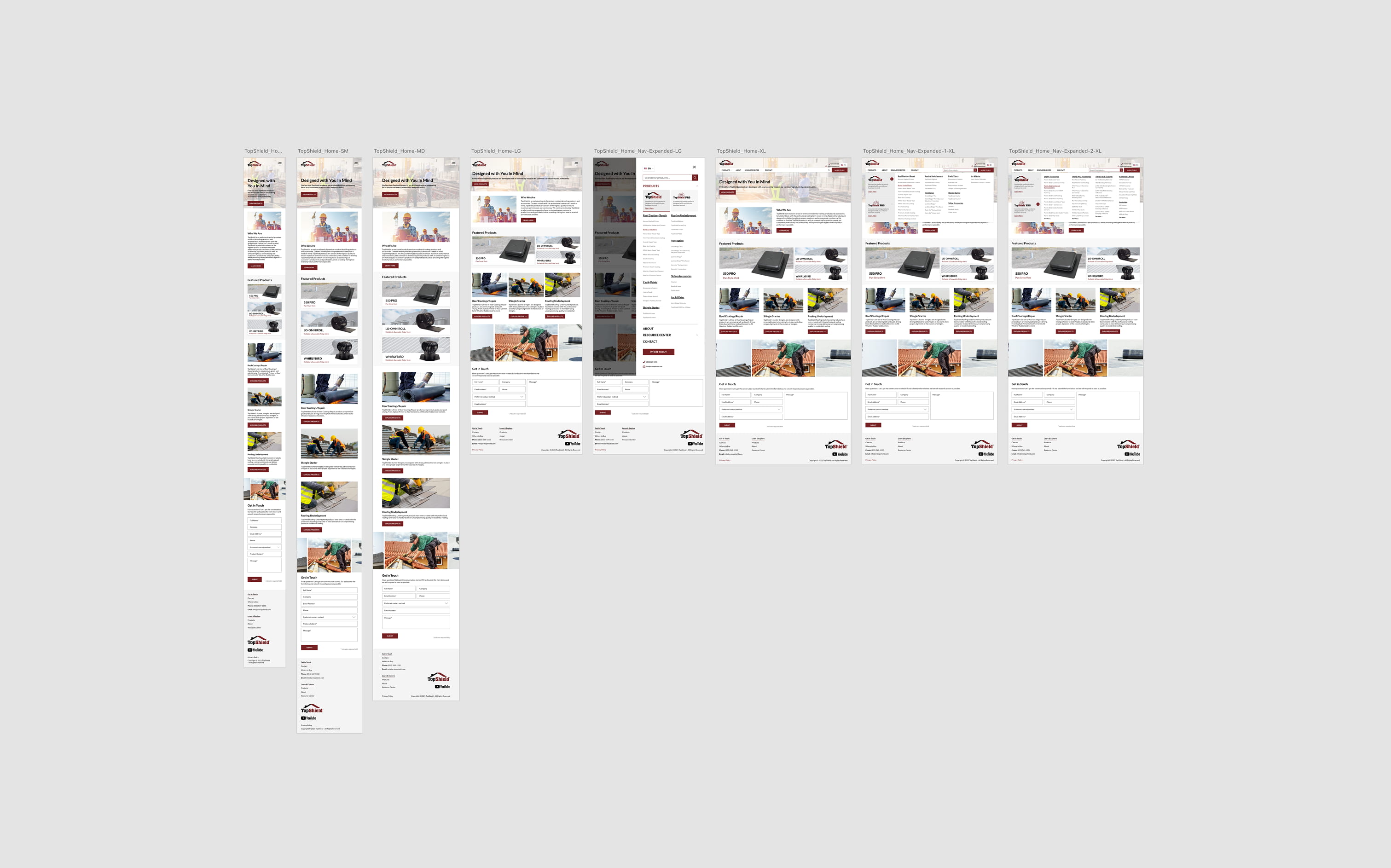
To begin the redesign process, our creative team brainstormed and iterated several possible design and content structure directions for the landing page. With these iterations, we went to the stakeholders and presented our potential design directions. Based on their feedback, we consolidated the iterations down to one draft. Once approved, we began fine-tuning the design by further structuring the page’s content hierarchy and visual direction.
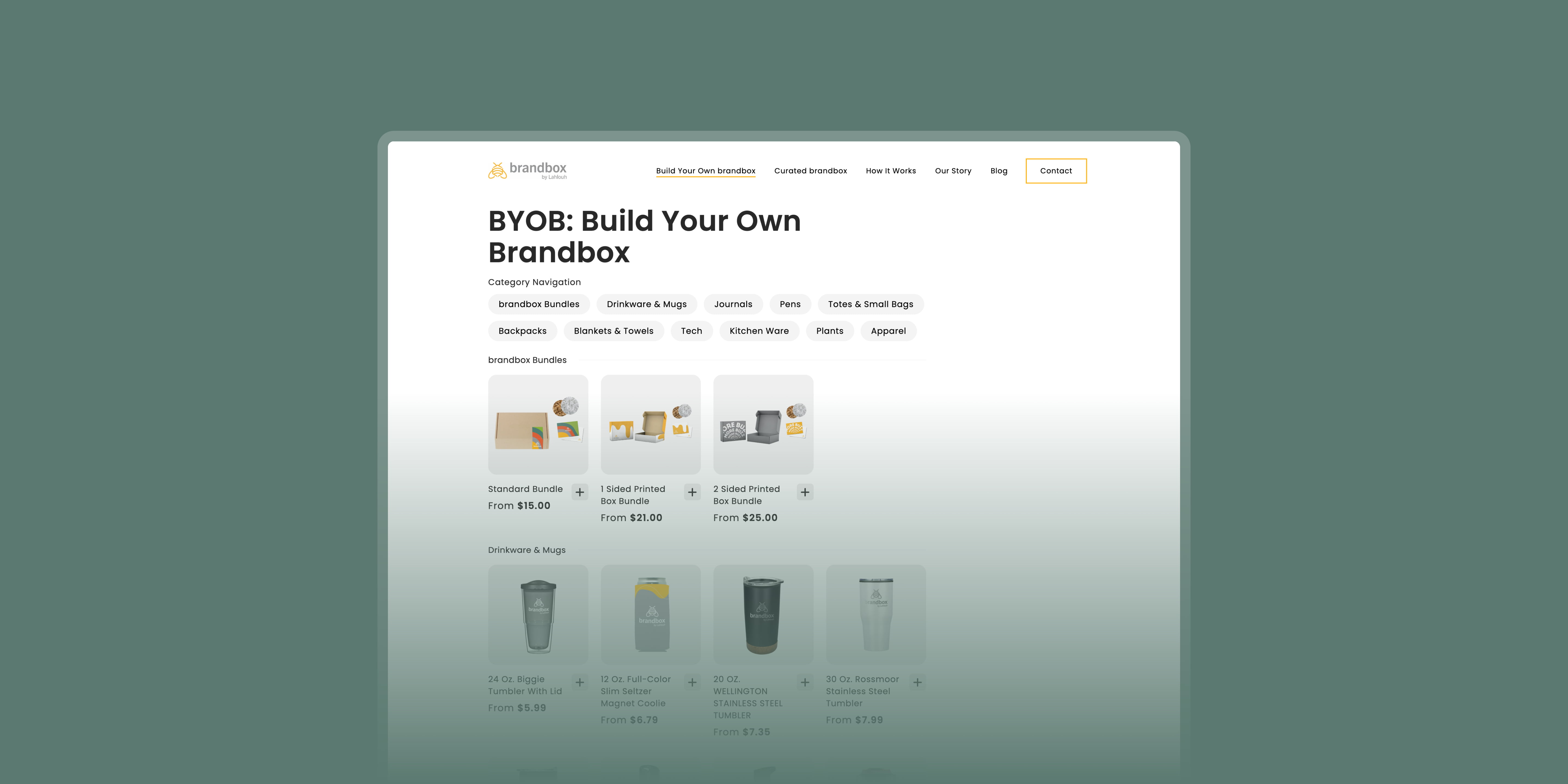
The original landing page was lacking detail on TopShield’s brand offerings. With this in mind, we created a content block at the top of the page that called out each TopShield brand offering. Each brand callout also includes a small blurb about the brand followed by a clickable link to learn more about the brand and to view product offerings.
.jpg)
To further highlight the brand’s strengths, we created a simple four card callout with short descriptions that showcase the brand’s distinctiveness. For example, two of TopShield’s main selling points are it’s sustainability and affordability. With this in mind, we highlighted these two features in the card callout.


.jpg)